Design is a funny thing.
On the one hand, it’s an incredibly useful tool that can help you to connect with people on a visceral level, using shapes and colors and a sort of visual order of operations to convey your message in a catchy, memorable way.
On the other, designs have a lot of potential elements. And while it can be fun to play with them, you need to be careful. Because, as the title says, one change can really muck things up.
Check out these fun examples we created:
“Creative” Lettering
You know what’s really cool and fun? When you integrate visual elements from the design with written copy.
A ball could be an “o”. You can have a triangle take the place of an “A”. Pool cue sticks could form an “X”, or one could be an “l”…
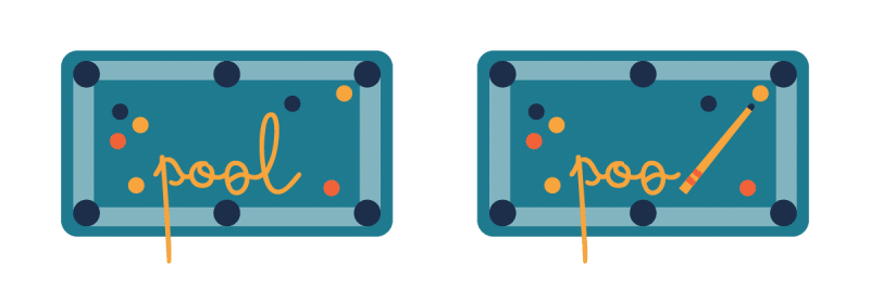
…oh.
Maybe that last one’s not such a good idea here.
Can We Make the Font More Edgy?
For written copy, generally the most important thing is to choose a common font that will show up on any screen and be easily legible.
Writing in designs, though, serves a different purpose.
It’s meant to convey a mood. A tone.
So it can be something you spend a decent amount of time on. You don’t want to just change it willy-nilly. Or provide unclear instructions.
For example, what if you have a design aimed at kids? But you want it to feel a bit more grown up, so older kids aren’t left out.
Your note: “Can we make the font more edgy?”
Edgy? Well, okay…
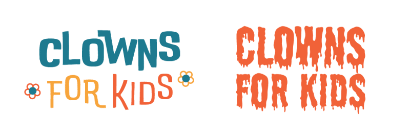
That edgy enough for you?
Okay. Obviously, that one is a bit of a stretch, but you get the point. Sometimes, even when something seems like a small, single, simple change, it can cause an unintentional problem.
Particularly if the instructions leave room for interpretation.
How about one more?
That’s Not How You’re Supposed to Read It
One cool thing design can do is create a visual hierarchy, telling you what to look at first – or, in what order words should be read.
Some of the most famous examples of this are with the Star Wars logos. Like this:
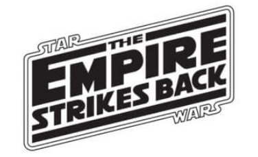
Or these:
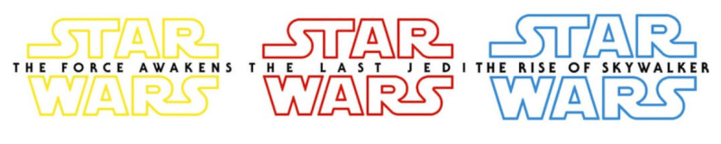
Audiences know, based on almost 50 years of branding, that they are supposed to read “Star Wars” first. Only then do you read the rest.
The more recent movie logos make this even clearer by making the words “Star Wars” huge compared to the rest of the title.
But what if you weren’t dealing with such a well-known brand? Or simply decided to do this with a phrase that didn’t lend itself to such treatment?
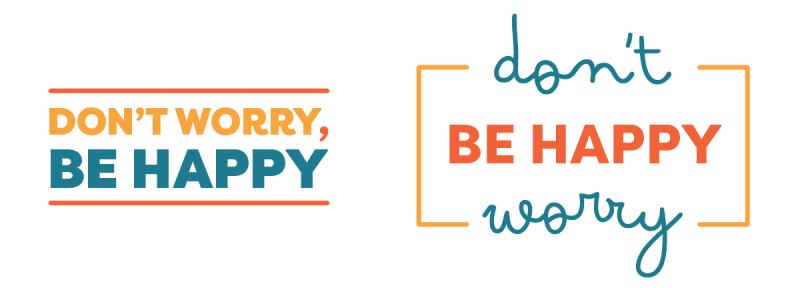
Oof.
It’s kind of funny… but only if that was your intention. If it wasn’t, you’ve got some seriously bad design going on. All from one potentially innocuous change.
Our point?
It’s very easy to muck up a design.
So make sure you work with a professional who is willing to be honest with you — and push back when the change you’re requesting may get in the way of your marketing goals.
